Fluid custom properties
By Trys Mudford
A core theme of the seminal introduction to responsive web design was an acceptance of the 'ebb and flow' found on our inherently fluid web. But despite a broadly accepted view that device-based breakpoints are flawed, and a myriad of solutions proposed to solve the problem, it's fair to say we still mostly think in terms of pre-defined breakpoints.
Writing truly isolated components and tailored breakpoints; where we reevaluate our original CSS decisions as the viewport gets to a size that breaks the component, is great in theory, but challenging in practice. Ubiquitous language in a team, and a natural desire to consolidate magic numbers tends to lead to either a set of easy to remember numbers: 30em, 40em, 50em, or more generic 'small, medium, large' mixin breakpoints. Both approaches create jarring 'breakpoint jumps' rather than a natural easing as a screen changes.
When there is shared styling between components, our instinct is to group the components in some respect. This tends to fall into one of three camps:
- Writing large selectors, or relying on Sass
@extends, despite its flaws and horizontal coupling. - Peppering our HTML with utility classes like
.mt18and.pb24. - Duplicating the common styles and accepting the performance hit.
These all work at a single width, but begin to fall apart as more screen sizes get involved. Here are some of the most common next steps to patch the issue:
- Adding
@mediabreakpoints to the utility classes and renaming them to something more generic. - Create multiple utility classes with breakpoint-specific suffixes, adding all of them to an element.
- Continuing the duplication with identical
@mediabreakpoints in each component.
None of these are ideal – not only are we duplicating code or coupling horizontally, we're still thinking about device-specific breakpoints. It's a problem, and it affects all aspects of our work – spacing, rhythm, layout and typography.
We need to think fluidly.
A proposal
Fluid custom properties combine CSS Locks, CSS Custom Properties, and the concept of hills (yes, hills). They allow us to write fluid CSS without writing any breakpoints.
A fluid custom property is a font-size representation of a gradient or slope, set between two screen sizes, and stored as a global CSS custom property.
With a predefined set of fluid custom properties at the heart of a project, we can hook onto them to create natural, breakpoint-less spacing and typography that gradually interpolates across screen sizes.
Relying on these global rules brings consistency across a project, and helps to ensure every component looks 'just right' on all screens. There are no nasty 'breakpoint jumps', just buttery smooth interpolation.
They significantly reduce code duplication and keep code succinct and readable. Rather than coupling horizontally, shared styles are linked vertically to these global, project-specific constants.
All the complicated maths is abstracted away, leaving you to work with natural numbers, browser text zoom preferences are respected, and they work naturally with ems.
They're also entirely opt-in; the brilliance of custom properties is that they do nothing to your webpage until you reference them. This makes it a great way to retrospectively add fluid sizing to an existing site.
Let's dig into the three concepts in a little more detail:
CSS Locks and interpolation
Linear interpolation is a mathematical technique used to calculate the value at a position between two points. In the CSS and animation world, Interpolating or 'tweening' is the process of smoothly changing a value between the two points over two screen sizes. We can achieve this effect with CSS locks, a technique created by Mike Riethmuller.
Below is a CSS lock that interpolates between a font-size of 1em and 2em between the two screen sizes of 20em (320px) and 50em. The locking is handled by the media query directly below it, without it the growth would continue at the same rate forever.
p {
  font-size: calc(1em + (2 - 1) * ((100vw - 20em)/(50 - 20)));
}

@media screen and (min-width: 50em) {
  p {
    font-size: 2em;
  }
}
Writing a lock by hand is pretty verbose, so Sass mixins are regularly turned to. This has the huge advantage of making your life as a developer easier, but the distinct disadvantage, like all pre-processor features, of distancing yourself from the final CSS output. Once you've been bitten by the fluid bug and seen its virtues, it's very easy to end up with several hundred CSS locks, and thus several hundred media queries. That's a lot of code.
CSS custom properties
There are plenty of wonderful guides to CSS custom properties, so I shan't go into too much detail. Here's a CSS custom property definition and usage example.
:root {
  --brand: #FF4757;
}

a {
  color: var(--brand);
}
Not only are they a great way to extract common values out to a central location, they can be overridden using the cascade, and used in calc() functions. Using custom properties for typography and vertical rhythm has been well documented, but they can be used for so much more. We can combine CSS custom properties with locks to great effect...
Refactoring the lock
Let's rewrite the CSS lock we used earlier, harnessing the descriptive power of custom properties. We start by extracting the configurable parts of the lock into a :root definition. The vast majority of CSS locks run from 20em/320px, so we'll keep that in the lock for brevity. Then we can substitute the values within the declaration and media query, multiplying the appropriate values by 1em:
:root {
  --max-value: 2;
  --min-value: 1;
  --max-screen: 50;
}

p {
  font-size: calc(
    (var(--min-value) * 1em) + (var(--max-value) - var(--min-value)) *
      ((100vw - 20em) / (var(--max-screen) - 20))
  );
}

@media screen and (min-width: 50em) {
  p {
    font-size: calc(var(--max-value) * 1em);
  }
}
Sadly, we can't use custom properties in the media query definition, so we have to repeat the 50em. But ignoring that, we've extracted all the other 'bits' of the calculation into a single source of truth. The CSS lock now looks even more unwieldy than it did before but – crucially – the bits we actually need to access are much easier to read.
Even more refactoring
With traditional CSS locks, you need a media query for every lock, but as fluid custom properties rely on cascading custom properties, we can solve this really elegantly in one line.
CSS locks use the 100vw unit to represent the varying screen size, but this doesn't have to be the case. We can extract that value into its own custom property: --f-screen.
When we've reached the 'lock point', rather than update all the CSS locks we have on the page, we can update the value of --f-screen to be the width of our --max-screen. This one line change holds every lock in its maximum state.
:root {
  --max-value: 2;
  --min-value: 1;
  --max-screen: 75;

  --f-screen: 100vw;
  --f-bp: (var(--f-screen) - 20em)/(var(--max-screen) - 20);
}

p {
  font-size: calc((var(--min-value) * 1em) + (var(--max-value) - var(--min-value)) * var(--f-bp));
}

@media screen and (min-width: 75em) {
  :root {
    --f-screen: calc(var(--max-screen) * 1em);
  }
}
This is a rather neat refactor, but it's still only working at a selector-level - we can still step it up a notch or two. But before we can talk about that, we need to talk about hills.
Hills, grades & slopes
When travelling by road, we can refer to the steepness of a hill by a gradient or grade. They're often given in terms of a ratio: 2:1 or a percentage: 30%. The higher the percentage, the steeper the incline, and the more likely you'll need to get off your bike and walk up the hill.
A CSS lock can also be visualised as a hill. The screen sizes define the where the hill starts and ends (or the foot and summit), and the two values (say, 1em and 2em) dictate the gradient. When plotted onto a graph, it looks a little like this:
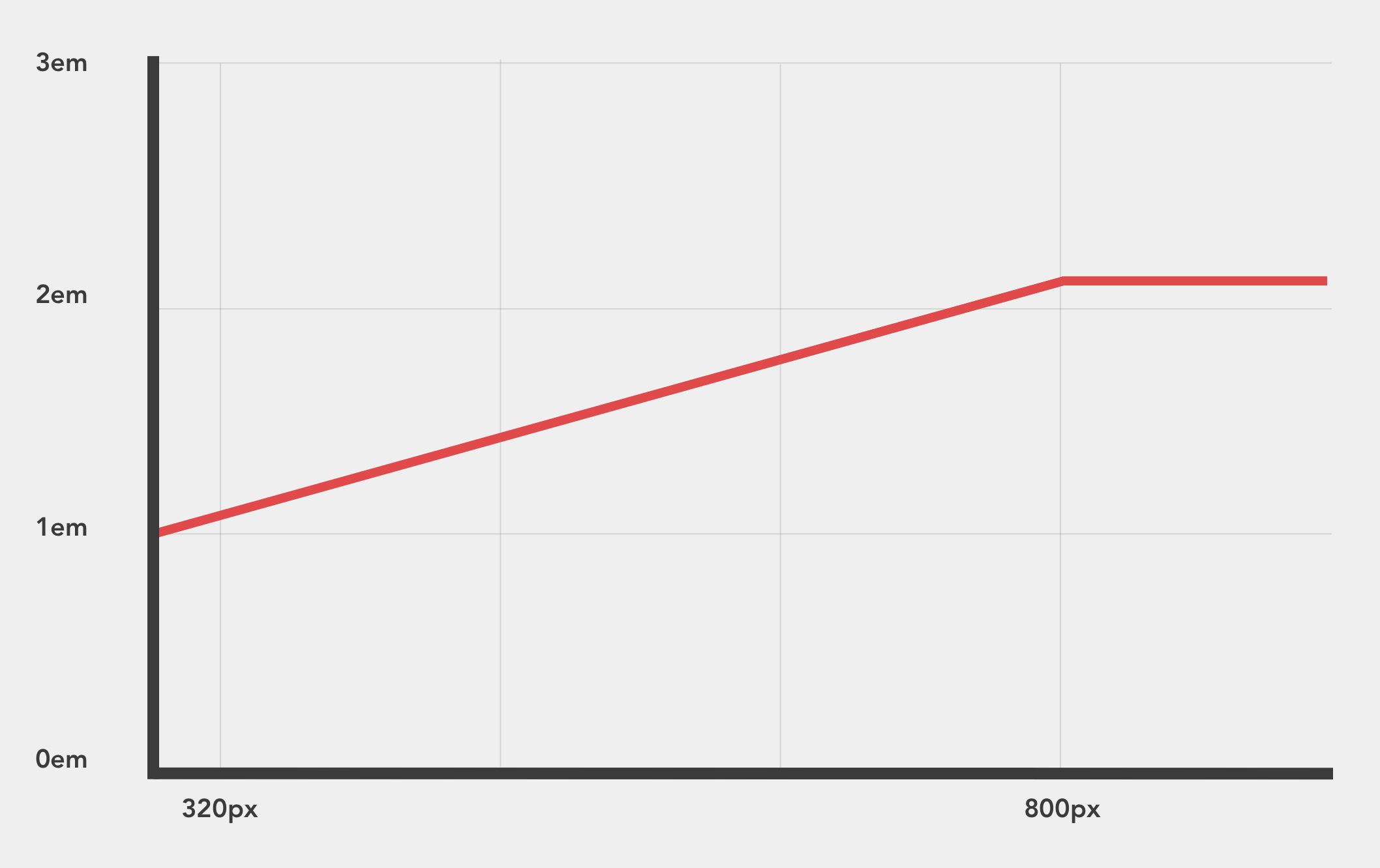
In this example, we're interpolating between two specific values: 1em and 2em, a relationship of 2:1. This is great, but a bit limiting. What if we wanted to interpolate between 2em and 4em. Fluid custom properties encapsulate that relationship into a fluid multiplier that lets you re-use that angle in various ways across a project.
The implementation
Below is the CSS for four fluid custom properties than run between 320px and 1200px.
:root {
  --f-summit: 1200;

  --f-screen: 100vw;
  --f-foot: 1 / 16;
  --f-hill: (var(--f-screen) - 20rem) / (var(--f-summit) / 16 - 20) + var(--f-foot) * 1rem;

  --f-1-25: ((1.25 / 16 - var(--f-foot)) * var(--f-hill));
  --f-1-5: ((1.5 / 16 - var(--f-foot)) * var(--f-hill));
  --f-2: ((2 / 16 - var(--f-foot)) * var(--f-hill));
  --f-3: ((3 / 16 - var(--f-foot)) * var(--f-hill));
}

@media screen and (min-width: 1200px) {
  :root {
    --f-screen: calc(var(--f-summit) * 1px);
  }
}
Let's break it down section by section.
--f-summit: 1200;
This property denotes the largest screen size in px. This gets converted to rems internally to ensure text zoom preferences are respected.
--f-screen: 100vw;
--f-foot: 1 / 16;
--f-hill: (var(--f-screen) - 20rem) / (var(--f-summit) / 16 - 20) + var(--f-foot) * 1rem;
--f-screen holds the width of screen (100vw) until we reach the summit. Extracting this make sets us up to be able to succinctly lock all the properties in one go. All fluid custom properties are ratios based off of 1, and --f-foot represents that.
--f-hill is the media query part of the lock, running from 320px to our --f-summit. By extracting this out from the back end of the CSS lock, and into its own CSS custom property, we can cap all the custom properties in one go - more on that later.
It's worth noting I've intentionally baked in the assumption of that start point. Extracting that out to another custom property is perfectly valid if it fits your use-case better.
--f-1-25: ((1.25 / 16 - var(--f-foot)) * var(--f-hill));
--f-1-5: ((1.5 / 16 - var(--f-foot)) * var(--f-hill));
--f-2: ((2 / 16 - var(--f-foot)) * var(--f-hill));
--f-3: ((3 / 16 - var(--f-foot)) * var(--f-hill));
These are the fluid custom properties themselves. --f-1-25 represents a gradient of 1.25:1. The names are down to personal preference, I like the clarity of exposing the gradient angle in the variable, but you may prefer more generic names like --f-shallow or --f-steep. Equally, you may find a name like --f-gutter would be more appropriate.
Side-note: custom properties aren't evaluated until they are used, so there's no need to wrap each one in a calc().
@media screen and (min-width: 1200px) {
  :root {
    --f-screen: calc(var(--f-summit) * 1px);
  }
}
Finally, we have the aforementioned screen width lock to prevent the values from growing to silly levels.
Using fluid custom properties
The actual values stored in fluid custom properties are tiny, so they need to be multiplied up to useful numbers. The multiplier you choose represents the pixel size of the value at 320px. You can calculate the final size by multiplying it against the gradient.
Let's look at a specific example, setting the font-size on the document body.
body {
  font-size: calc(var(--f-1-25) * 16);
}
This declaration will interpolate between 16px and 20px (16 * 1.25 = 20), without a breakpoint jump. All screens will get an appropriate font-size somewhere in between those two values.
Now we've written that, we can use ems in the normal way to get relative fluid sizing off the body.
h3 {
  font-size: 1.5em;
}
This will size h3 tags to be 24px on small screens, gradually changing up to 30px on larger screens.
Working with steeper gradients
Here's an example for a hero banner. These are normally pretty painful to write, involving multiple padding breakpoint jumps as the screen expands. But when we use a fluid custom properties at a steeper gradient, we can achieve it in one line:
.hero {
  padding: calc(var(--f-5) * 40) 0;
}
This gradient of 5:1 interpolates the vertical padding between 40px and 200px as the screen gets larger.
The flexibility of different gradients give us a multitude of options to build with. If you're after tight spacing on mobile and ample on larger screens, choose a steeper gradient multiplied by a smaller number. If you want similar spacing on both, increasing ever so slightly, take a shallower gradient and multiply it by a larger number. You can even use negative gradients to make reductions on larger screens!
Fluid custom properties can be applied to margins, border-widths, padding, font-size, grid-gaps, transforms and all manner of other properties.
Common patterns can be consolidated in other CSS custom properties to reduce the number of calc() function calls. There's also no reason why they can't be applied to design tokens or utility classes. These common calculations can then be surfaced in a design system to ensure maximum usage and understanding on a project.
First published on 3 February 2020